This is where you will find a few of the down and dirty case studies I been challenged with in my years.
• When Everyone Has An Opinion
• Mongoose Magalog
• No Pink Required
• Seeing is Believing
• Naming Things Is a Design Skill
• Mongoose Magalog
• No Pink Required
• Seeing is Believing
• Naming Things Is a Design Skill
When Everyone Has an Opinion
A global product, competing opinions, and a 15-day deadline — solved with clarity, collaboration, and a solid plan.

This project highlights how I approach misalignment: step back, listen, create structure, and move forward with confidence — even when timelines are tight and stakeholders are global.
Context
The GT Avalanche hardtail was headed to a global market, but the design direction was split.
Was it a freestyle bike? Or an entry-level race bike?
Was it a freestyle bike? Or an entry-level race bike?
Different regions had very different opinions, and the design direction started drifting fast.
The Challenge
The product manager steered the design toward a freestyle look fun, edgy, bold.
Global stakeholders pushed back hard, insisting the Avalanche needed to read as an entry-level race bike, not a park toy.
Global stakeholders pushed back hard, insisting the Avalanche needed to read as an entry-level race bike, not a park toy.
The result?
Two competing design directions, conflicting specs, and a sales presentation that had to satisfy everyone yesterday.
Two competing design directions, conflicting specs, and a sales presentation that had to satisfy everyone yesterday.
Oh, and the timeline?
15 days to design, select colors, build tech packs, and produce samples for global review.
15 days to design, select colors, build tech packs, and produce samples for global review.
No pressure.
My Role
I was the designer responsible for delivering multiple design directions and making sure they could actually be produced on time.
Beyond the design work, I:
• Pulled clarity from very unclear feedback
• Identified which markets were pushing back and why
• Aligned sales, product development, and factory expectations
• Translated global opinions into something actionable for design and production
• Identified which markets were pushing back and why
• Aligned sales, product development, and factory expectations
• Translated global opinions into something actionable for design and production
This was less about picking colors and more about connecting people, priorities, and reality
The Solution
I stepped back and built structure around the chaos.
• Created a clear, shared design brief that reflected key distributor feedback, not assumptions
• Defined timelines, decision points, and examples so everyone reviewed the same thing
• Set realistic expectations with the factory on design complexity and production constraints
• Built a forward-looking market visit plan to work directly with key distributors in future seasons
• Most importantly, I focused on building trust in the process, not just the final design.
Impact
40% higher forecasting confidence across global markets
• Stronger alignment on color, graphics, and product positioning
• Fewer late-stage pivots and clearer approvals in future seasons
• A more collaborative relationship between design, sales, and global stakeholders
• The bike finally knew what it wanted to be, and so did everyone selling it.
• Fewer late-stage pivots and clearer approvals in future seasons
• A more collaborative relationship between design, sales, and global stakeholders
• The bike finally knew what it wanted to be, and so did everyone selling it.
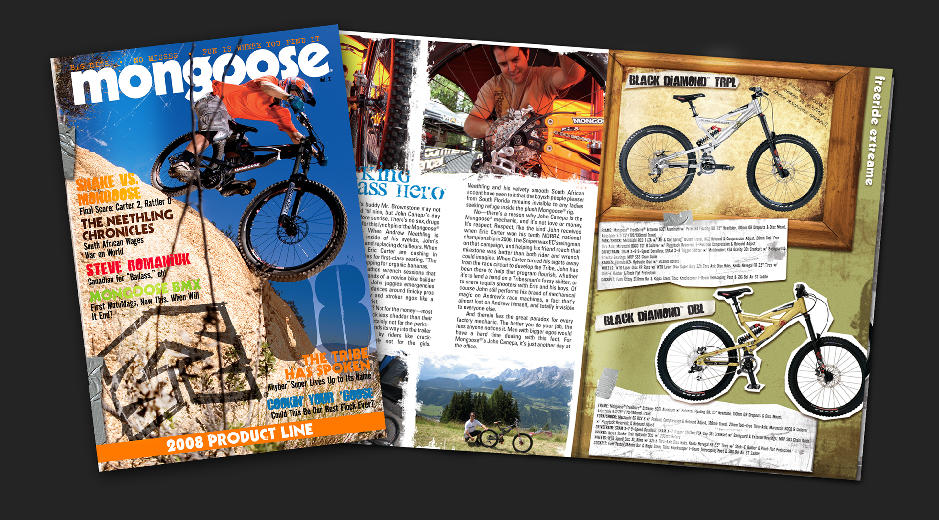
Mongoose Magalog
Turning a product catalog into a culture piece, without a copywriter and on a real-world timeline.
Context
In 2007, product catalogs weren’t just sales tools they were personality statements. They had to sell the full product line and tell a brand story people wanted to spend time with.
Mongoose took its first swing at a magazine-style catalog the Magalog. The idea was right, but the execution was rough. Content was thin, photography arrived late, images needed heavy editing, and there wasn’t enough editorial material to fully support the concept.
The first attempt taught us a lot, mostly what we needed to do better.
The Challenge
We were building a magazine without a few key ingredients.
• No in-house copywriter
• Photo retouching needed on a tight budget and timeline
• Spec grids were constantly changing and reviewed late
• Content and assets arrived out of sequence, slowing layout
The vision was solid. The process needed structure.
My Role
I was the lead brand graphic designer responsible for shaping the overall look and feel of the Magalog and keeping the project moving forward.
That meant:
• Designing the editorial-style layouts and visual system
• Reviewing, retouching, and cropping photography as it came in
• Working closely with marketing to source imagery and fill content gaps
• Translating dense Excel spec spreadsheets into clean, readable layouts
• Creating the final resource and spec pages that anchored the catalog
I wasn’t just designing pages. I was connecting content, visuals, and production reality.
The Solution
We treated the Magalog like a real magazine and built a process to support it.
• Brought in a former Mongoose marketing lead to handle interviews and editorial copy
• Started the project two months earlier than previous catalogs to allow time for content development
• Established weekly check-ins to keep teams aligned and momentum steady
• Tightened collaboration between design, marketing, and photography so layout decisions could happen faster
Once the structure was in place, the creative finally had room to breathe.
Impact
The Magalog struck a chord.
• Customers and retailers regularly asked for extra copies
• The catalog became something people wanted to keep, not toss
• It deepened connection to the brand featuring riders, employees, and culture, not just products
• The Magalog became a collector-style piece
It proved that when creativity is supported by the right process, even a catalog can become a brand moment.
No Pink Required
Designing a women’s bike line without shrinking it, pinking it, or talking down to the rider.
Context
GT has always been an inclusive brand, and we wanted to build a bike line that genuinely invited more women into cycling, especially mountain biking.
From day one, the female product manager and I agreed on one thing:
We were not going to “shrink it and pink it.”
We were not going to “shrink it and pink it.”
The goal wasn’t to make a bike for women as a marketing move.
It was to make bikes we actually wanted to ride with a look anyone would be proud to own.
It was to make bikes we actually wanted to ride with a look anyone would be proud to own.
The Challenge
The big question wasn’t color. It was whether we truly needed women’s-specific geometry or whether comfort, confidence, and touch points mattered more.
Other brands leaned hard on geometry changes to justify women’s lines. We needed real research and rider insight, fast to validate whether changing the frame was necessary, or if we could design a more inclusive product without fragmenting the line.
This wasn’t about opinion. It was about proof.
My Role
I led rider research focused on color, graphics, and the subtle details that make a bike feel intentional, not generic.
I:
• Interviewed a diverse panel of women riders
• Gathered feedback on colorways and graphic treatments
• Identified design details that made bikes feel considered and welcoming
• Ensured the final look appealed across markets and genders
My focus was simple: Design bikes that felt like they were made with women, not for them.
The Solution
We brought the riders into the room.
I helped organize and facilitate a women-led panel that included:
• A world-class downhill athlete
• A lifelong mountain biker and enduro racer
• A fitness-focused mountain bike enthusiast
• A competitive road cyclist
• The product manager and myself
We talked about everything, not just aesthetics:
• Frame geometry and fit
• Saddles, handlebar widths, crank arm lengths, and grips
• Color, graphics, and surface finishes
• The experience of walking into a bike shop
• What makes a bike purchase feel empowering, or alienating
By widening the conversation, the design decisions became clear.
Impact
The result was a bike line that fit all riders, without segregating the product or relying on stereotypes.
• One shared geometry that worked for both men and women
• Thoughtful color palettes with subtle, feminine cues
• A refined pearl finish with a fishnet-inspired texture; confident, not cute
• Bikes that felt intentional, inclusive, and desirable
No pink required. Just listening, clarity, and respect for the rider.
Seeing Is Believing
Using realistic renderings to replace opinions with clarity.
Context
Every year, bike concepts were presented to stakeholders through PowerPoint decks. And every year, the same thing happened:
lots of questions about color, tube shapes, finishes, and “how it would really look.”
lots of questions about color, tube shapes, finishes, and “how it would really look.”
Flat Illustrator renderings struggled to show depth, metallic flake, pearl finishes, and the complexity of modern bike frames. Bikes aren’t flat objects, they’re all curves, angles, and details, and poor monitors or projection systems didn’t help.
The result?
More opinions, more revisions, and more time spent explaining instead of deciding.
More opinions, more revisions, and more time spent explaining instead of deciding.
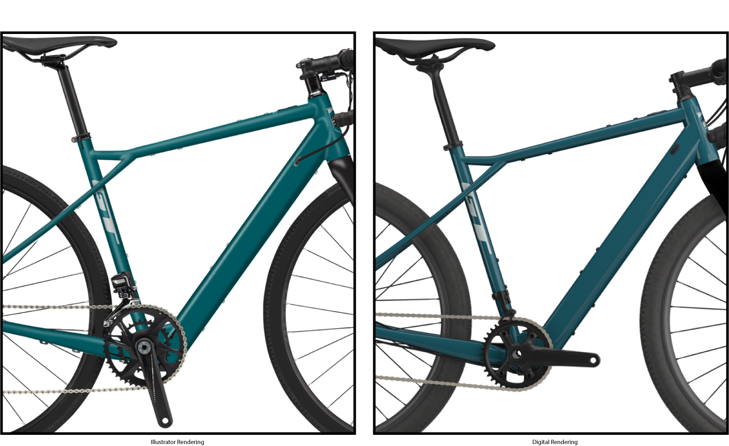
The Challenge
Accurately translating color and finish was nearly impossible with 2D tools alone.
• Metallics and pearls lost their depth
• Tube shapes were hard to read
• Paint tubes passed around meetings only told part of the story
• Decal mockups helped, but still left too much to interpretation
We needed a way to show the whole bike clearly and convincingly, before production.
My Role
I was responsible for presenting the full color and graphic direction for the GT Bicycles product line to global stakeholders.
Beyond the presentation itself, I:
• Represented customer expectations for visual impact
• Partnered across brands to improve concept accuracy
• Advocated for tools that reduced ambiguity and sped up decisions
My goal was simple: Answer the questions before they were asked.
The Solution
We partnered with R&D to create accurate 3D digital models of the bikes.
Using real geometry, I worked closely with the 3D team to:
• Dial in color accuracy
• Define material finishes (metallic, pearl, matte)
• Place decals correctly across complex tube shapes
• Account for all the small parts that make or break the final look
Guiding the renderers wasn’t just about realism, it was about trust.
Impact
The difference was immediate.
• Presentations were met with far fewer questions and revisions
• Concepts were approved faster and with more confidence
• Stakeholders could clearly see how bikes would look in production
• Color accuracy reached ~90% for metallic and pearl finishes
Sell-in became easier, decisions came quicker, and the process became, dare I say, enjoyable.
When people can see it clearly, alignment follows.
Naming things is a design Skill
Creating a file and folder system that keeps teams aligned, assets discoverable, and projects moving.
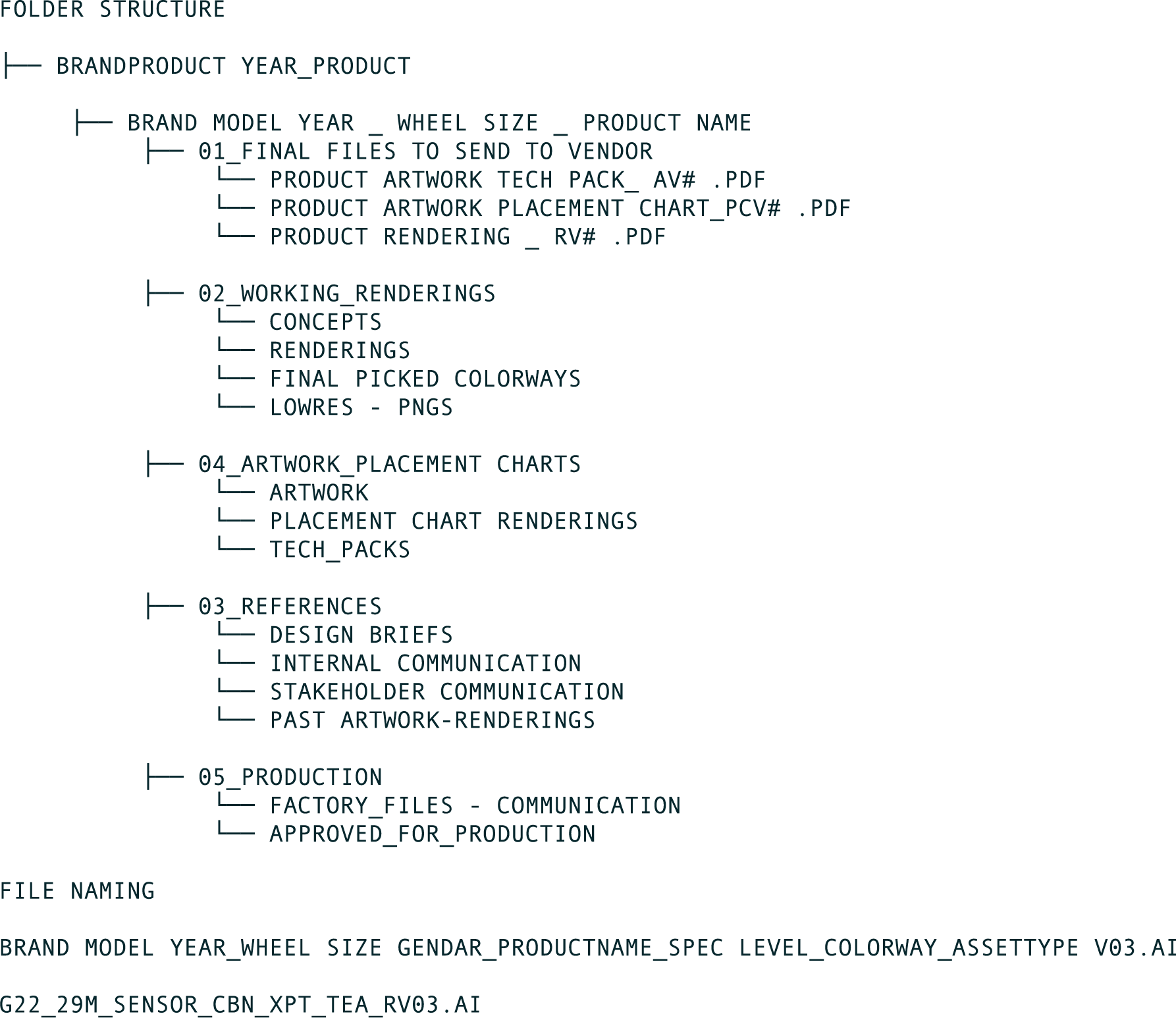
Context
As teams grew and projects multiplied, so did the files.
Multiple brands, designers, seasons, and global stakeholders were all working at once, but there was no shared logic for how files were named or where they lived.
Product and marketing used different systems, long file names broke servers, and valuable time was being lost to searching, re-exporting, and rebuilding work that already existed.
The creative work was strong.
The infrastructure was not.
The infrastructure was not.
Without a shared system:
• File names were inconsistent and often too long to function reliably
• “Final” meant something different to everyone (finalfinal_version3final)
• New designers took too long to onboard
• Renderings, artwork, and tech packs were easily confused during handoff to factories and stakeholders
• “Final” meant something different to everyone (finalfinal_version3final)
• New designers took too long to onboard
• Renderings, artwork, and tech packs were easily confused during handoff to factories and stakeholders
The problem wasn’t talent, it was clarity.
My Role
I took ownership of designing a system that worked for real people, real deadlines, and real production constraints.
• Designed the file and folder system from the ground up
• Defined naming conventions that worked for all brands, seasons and project types
• Set clear rules for versioning and where final files actually live
• Educated the team and help drive consistent adoption
• Defined naming conventions that worked for all brands, seasons and project types
• Set clear rules for versioning and where final files actually live
• Educated the team and help drive consistent adoption
This wasn’t about perfection, it was about usability.
SOLUTION
I created a standardized folder hierarchy that was easy to understand at a glance and consistent across all projects.
• Established clear, concise naming conventions that worked with server limitations
• Defined what “final” actually means, and where it belongs in the structure
• Separated WIP, review, and production-ready files to reduce confusion
• Built a system flexible enough to scale as teams and projects grew
• Defined what “final” actually means, and where it belongs in the structure
• Separated WIP, review, and production-ready files to reduce confusion
• Built a system flexible enough to scale as teams and projects grew
The goal was simple:
If you didn’t create the file, you should still be able to find it, fast.
If you didn’t create the file, you should still be able to find it, fast.
Impact
• Faster handoffs between design, marketing, and production
• Easier onboarding for new designers
• Fewer duplicate files and rework
• Less time searching, more time designing
• Easier onboarding for new designers
• Fewer duplicate files and rework
• Less time searching, more time designing
Sometimes the most impactful design work isn’t what you see, it’s what quietly makes everything else work better.